Camellas’ Cupboard
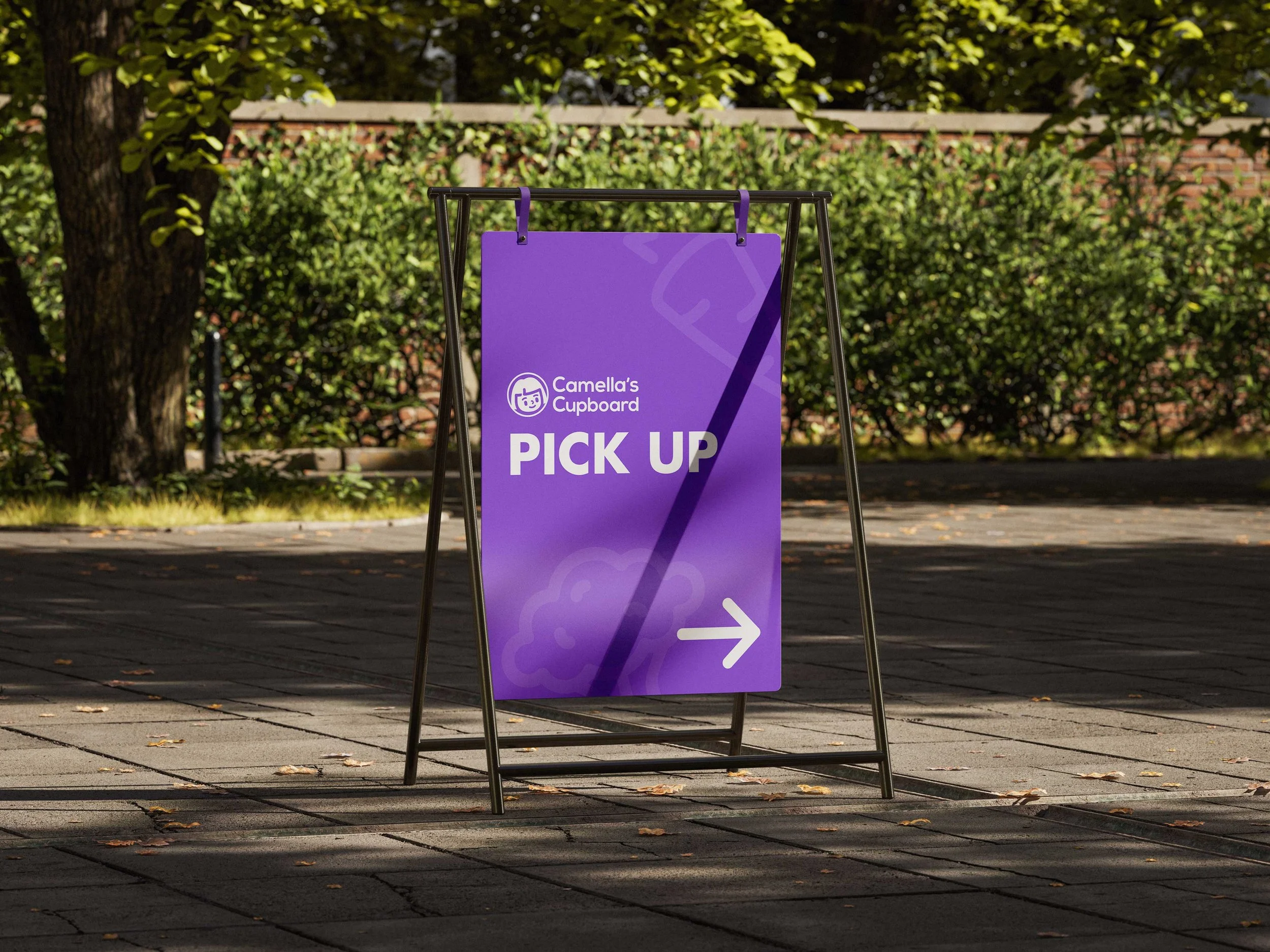
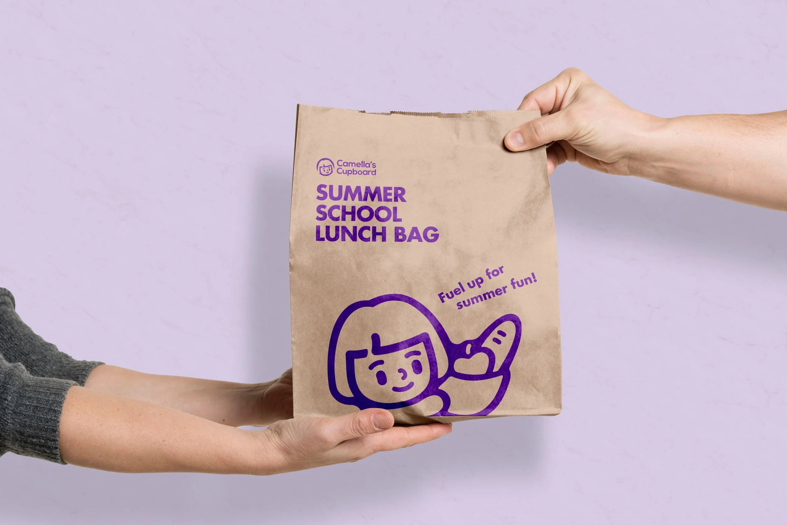
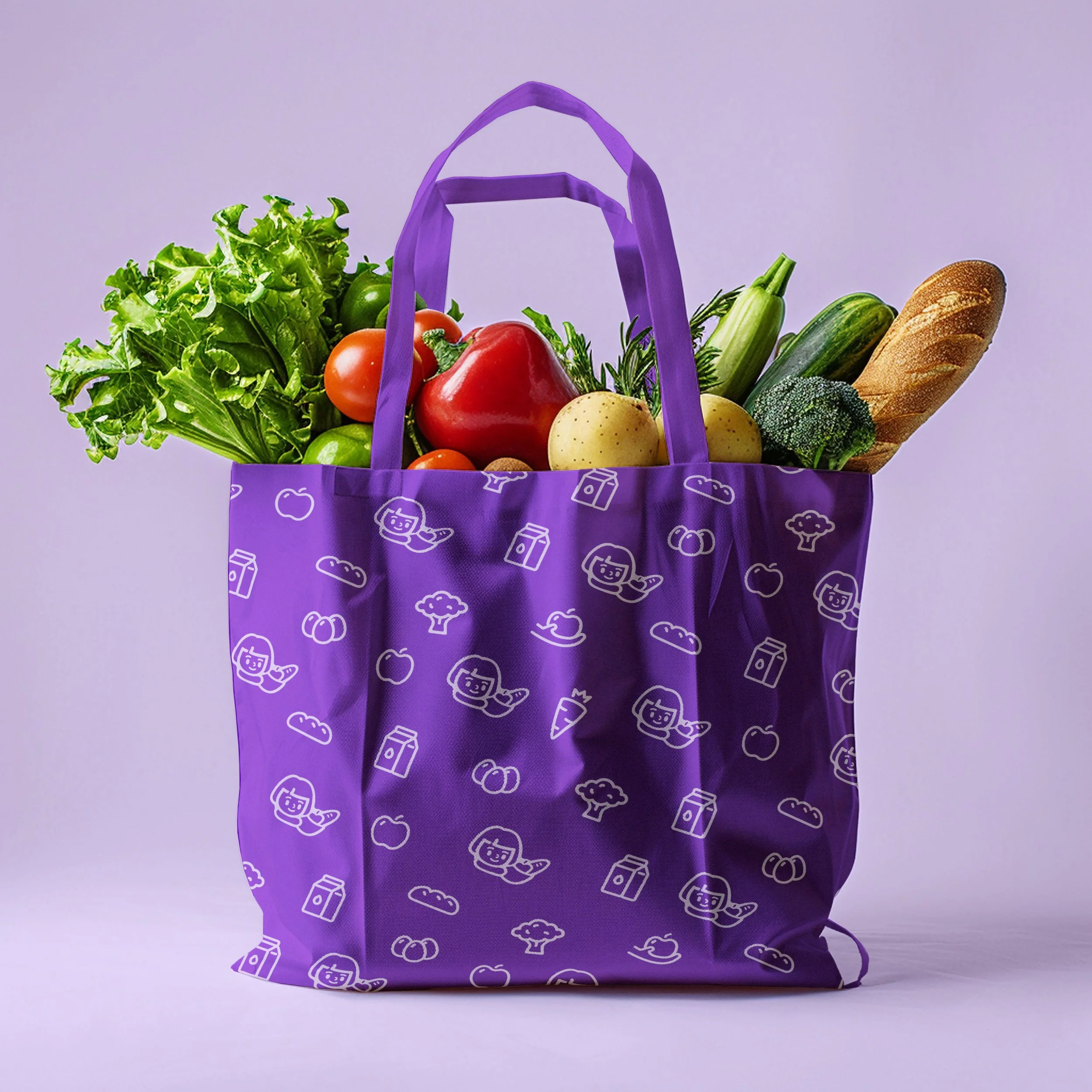
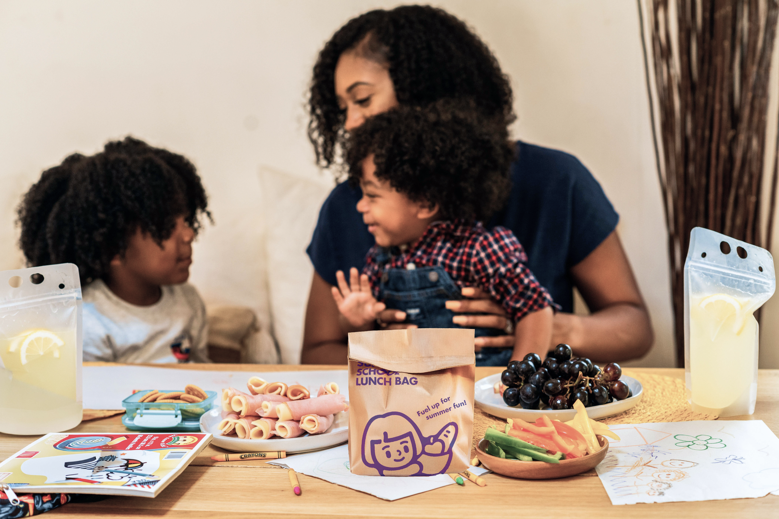
Camellas Cupboard is a local nonprofit food pantry in New Milford, where I have volunteered for the past year. While the organization had a recognizable name and purple color, its visual assets lacked cohesion and clarity. To address this, I redesigned the brand identity by creating a new logo, a pattern system, and various applications such as social media templates, email layouts, leaflets, tote bags, lunch bags, signage, and staff T-shirts, establishing a more unified and approachable visual system.
The new identity is inspired by the founder’s memory of her mother’s childhood, which reflects the organization’s origin story. I transformed the original photograph-based logo into a warm character illustration. The character’s gentle smile and upward gaze were designed to symbolize hope, positivity, and the supportive spirit of the food pantry.
To create a friendly and community-centered visual tone, I used rounded line drawings and expanded them into graphic elements and patterns applied across packaging and signage. I also refreshed the existing purple brand color into a more vibrant tone to strengthen brand recognition. The photography direction focuses on bright, warm scenes that highlight diverse community members sharing food and meaningful moments, reflecting the heart of the organization’s mission.
Although this was a self-initiated project, the rebrand is designed to offer a clearer and more consistent visual identity that can support Camellas Cupboard’s communication across digital and physical touchpoints. The cohesive visual system strengthens emotional connection with the community and helps the organization become more instantly recognizable through a warm, accessible, and hopeful visual language.